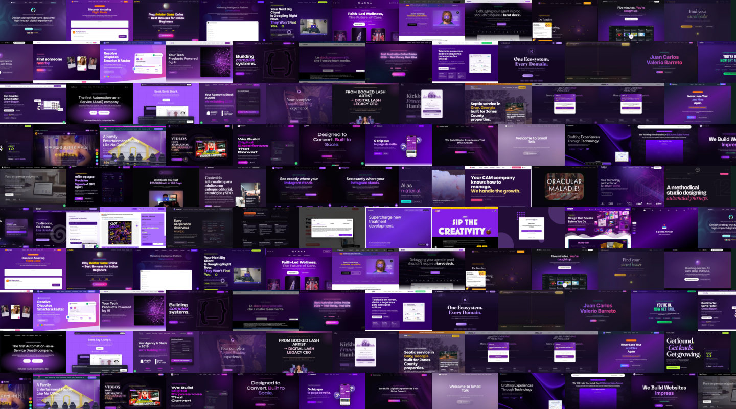
Purple
Reign68 sites
Indigo-to-violet hero gradients, glass cards, one centered CTA. The default SaaS look.
Millions of websites are now designed by machines - same fonts, same gradients, same layouts. We measure how fast the generated look is spreading, and we map what it looks like.
Slopymap continuously scans the web - tens of millions of domains, month after month. A transparent detector reads each page's public HTML and CSS and scores it against 68 design signals. Flagged pages are screenshotted, classified, and clustered with their visual siblings - so the same template surfaces as one island of near-identical websites on the atlas.
We believe every design should be unique - it should carry something of the person or the brand behind it. The universally agreed-upon look of AI-generated sites is not helping creativity: it mass-produces slightly different copies of the same page. That sameness costs something real - user engagement, and trust in the brands behind the sites. We map it so people can see it.
The atlas groups twenty thousand screenshots by pure visual similarity - and the generated ones collapse into a handful of recurring looks. These are four of the biggest islands, straight from the map.
Open the atlas
Indigo-to-violet hero gradients, glass cards, one centered CTA. The default SaaS look.
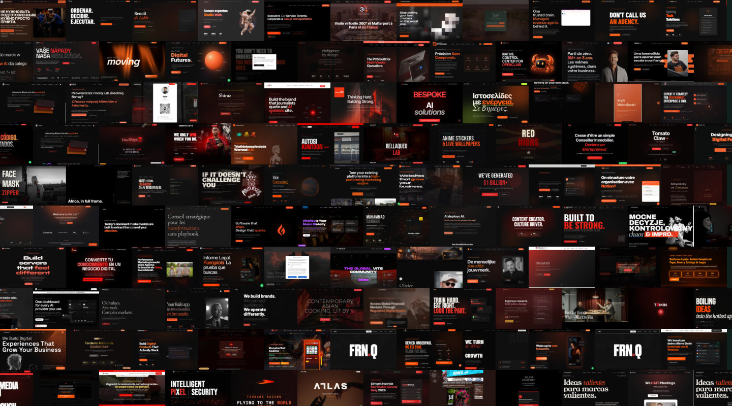
Near-black pages lit by warm orange accents - the classic generated dark mode.
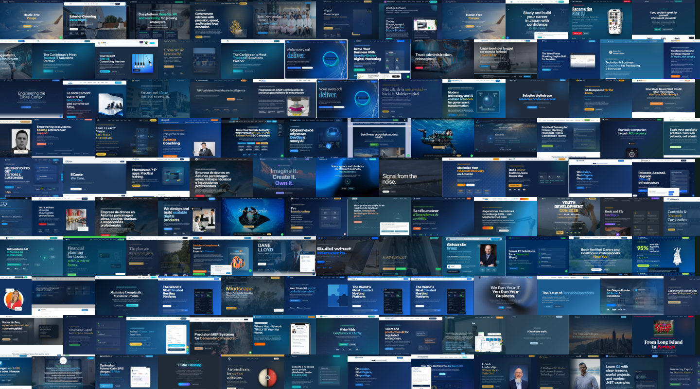
Trust-me blues, dashboard screenshots and three feature columns that mean business.
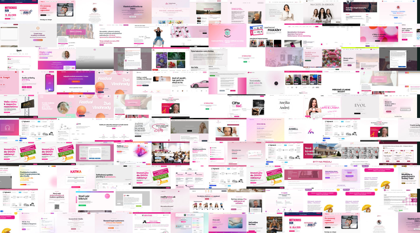
Pinkish pastel gradients and soft shadows for shops that want to be your friend.
Out of 497,865 pages flagged in a single Common Crawl snapshot, these scored highest - each one tripped thirty-plus detector signals. Click a row to see the full page.
The same pairing on site after site: Space Grotesk headings, Manrope body, JetBrains Mono numbers.
Em-dashes and middots everywhere: "Not just X - Y" taglines, features separated by dots.
Tiny uppercase labels above every heading: WHY US, HOW IT WORKS, FAQ.
Frosted-glass panels floating on purple-to-pink gradients.
The key word of the headline, clipped to the same purple-pink gradient.
lovable.app and vercel.app domains - with the "Edit with Lovable" badge left in the corner.
Open method, run monthly - the same domains, the same signals, humans in the loop.
Every month we read 61 million domains from the newest Common Crawl snapshot.
Sixty-plus HTML and CSS signals score each page - markers of hand-built sites subtract, keeping the verdict conservative.
Screenshots are embedded by a vision model and laid out by similarity - that map is the Slop Atlas.
People swipe through screenshot decks to ground-truth the detector - 20,090 labels and counting.
The detector is only as good as its ground truth. Try it right here - look at the site, go with your first impression. The real deck has 35 cards per round, a two-minute guide first, and no sign-up beyond a name and email.
Twenty thousand websites on one map. The generated ones are easy to spot - that is the point.